

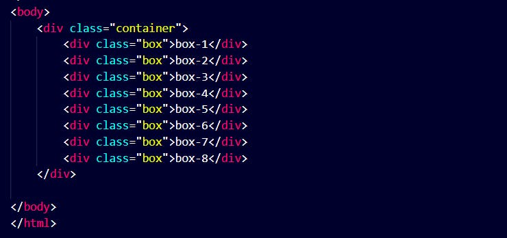
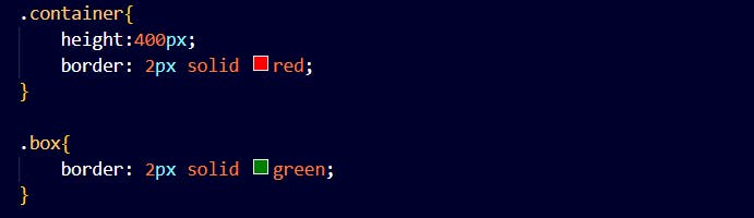
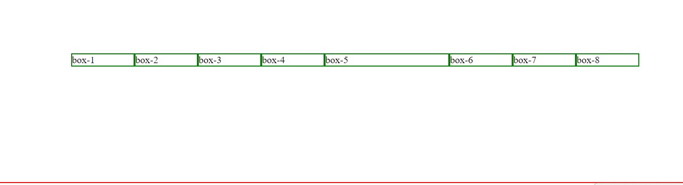
To start using Flexbox we need to first define a container.
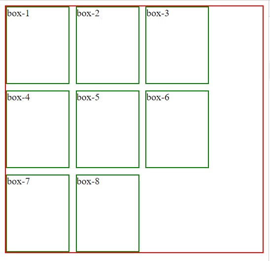
The above code has a container with 8 flex items.
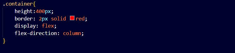
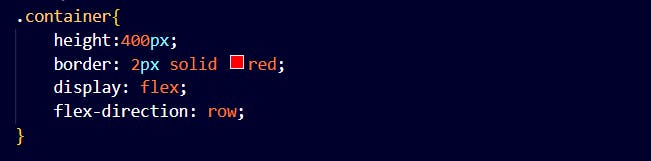
Flex-direction
This property defines in which direction the container wants to stack the flex items.
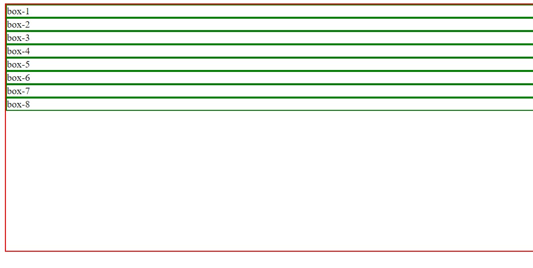
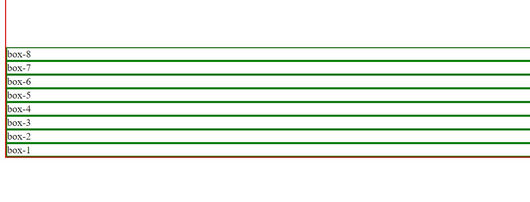
Column
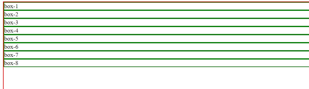
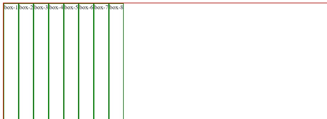
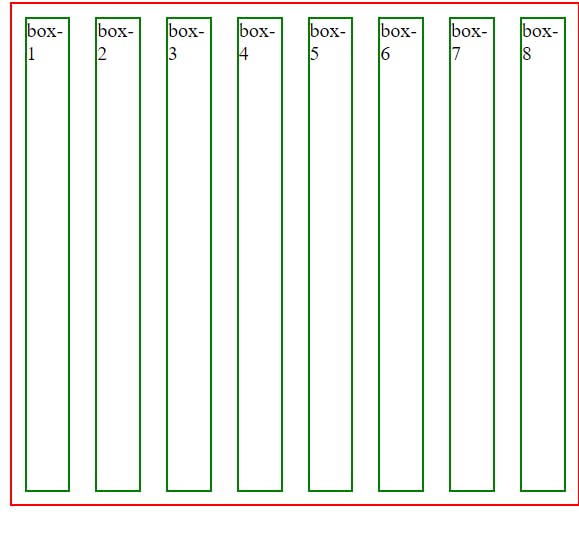
row
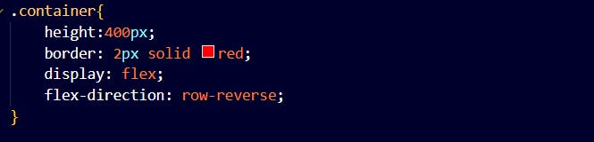
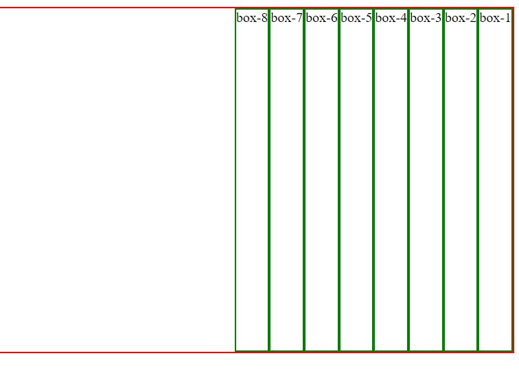
row-reverse
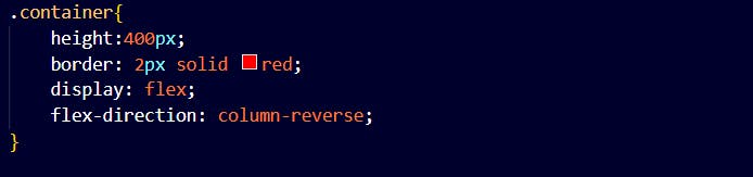
column-reverse
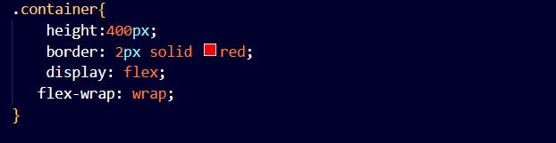
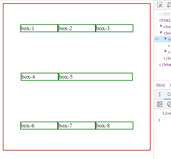
Flex-wrap
This property specifies if the flex items must wrap or not.
Now normally without using a wrap
When we try to minimize the screen the contents within flex start to shrink.
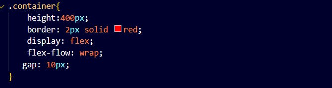
By using flex-wrap
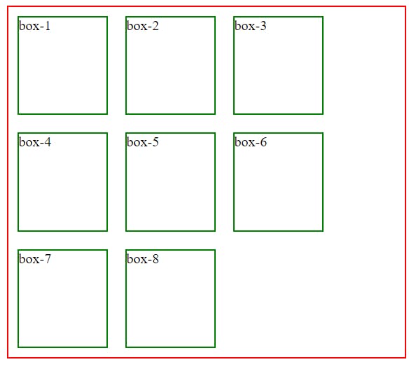
On minimizing the screen the contents do not shrink.
Flex-flow
This property is used for setting both flex-direction and flex-wrap properties.
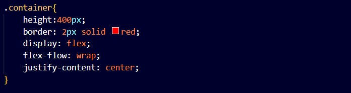
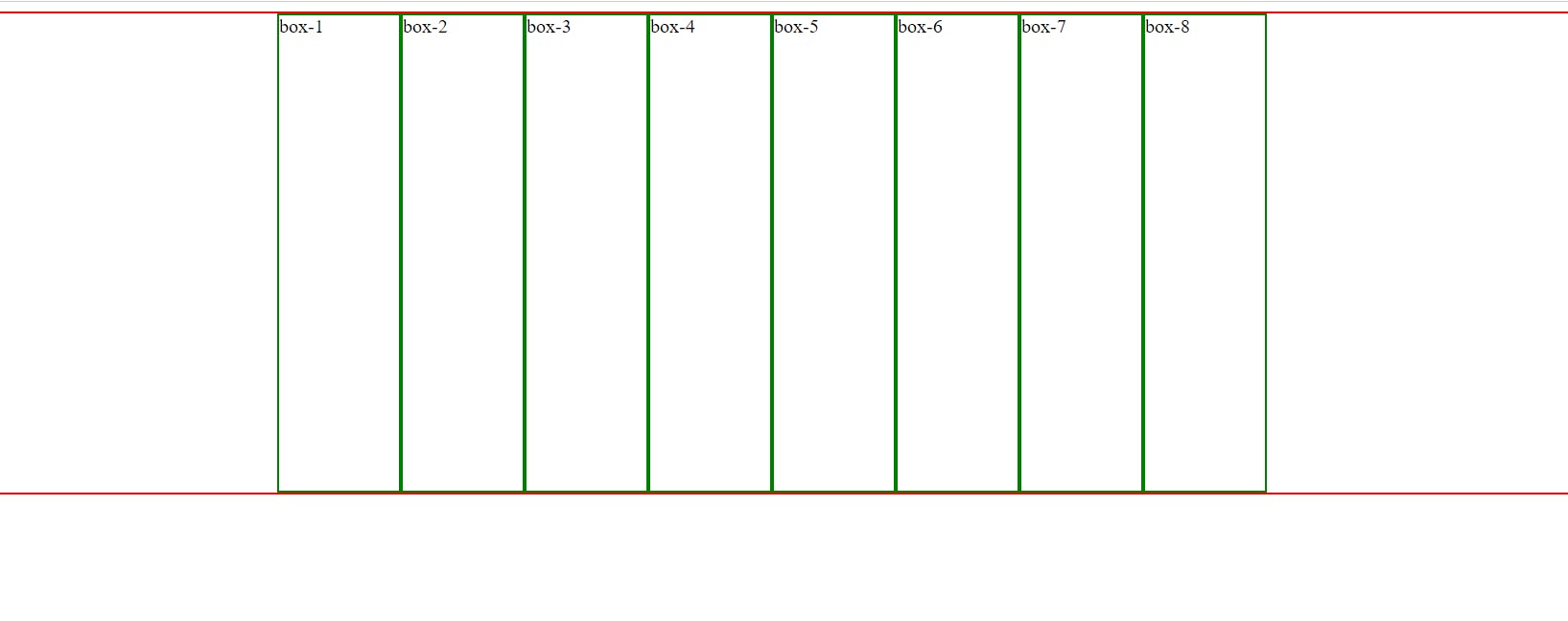
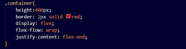
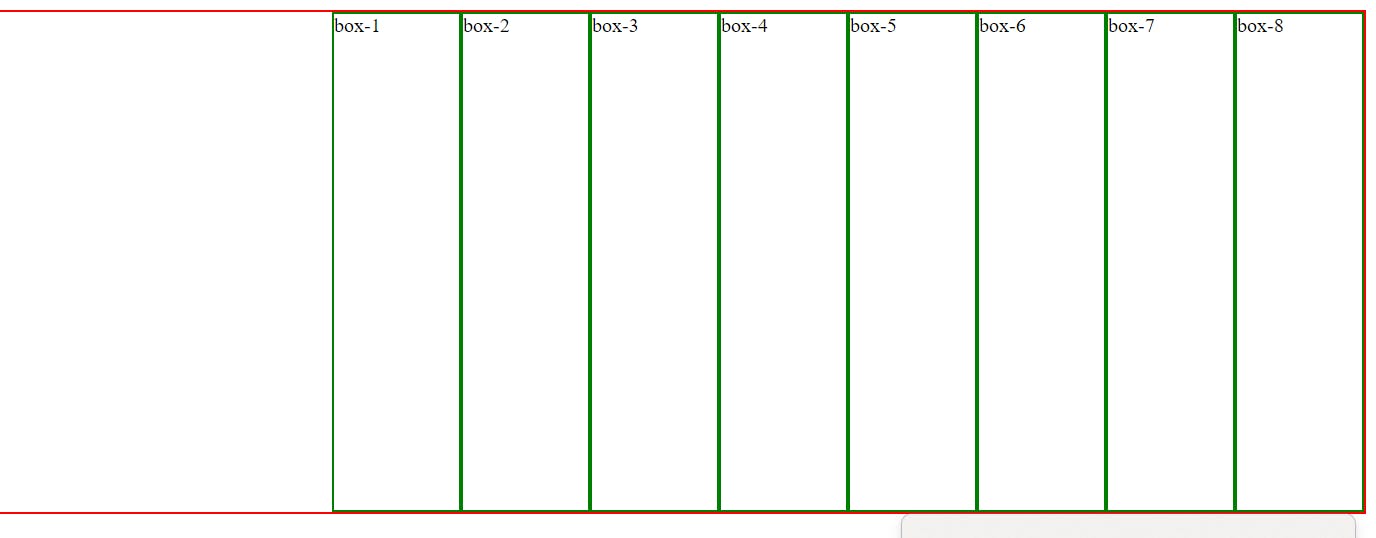
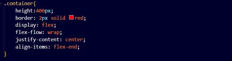
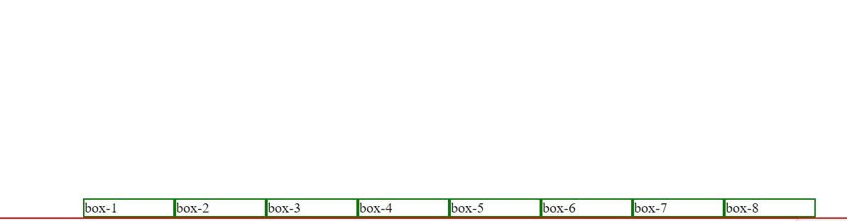
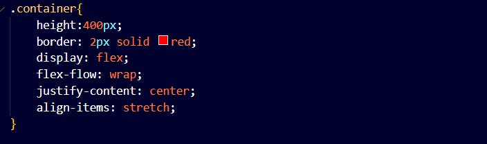
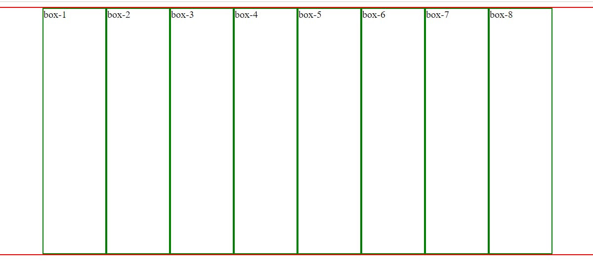
justify-content
This property is used to align the flex items at the center of the container.
space-around
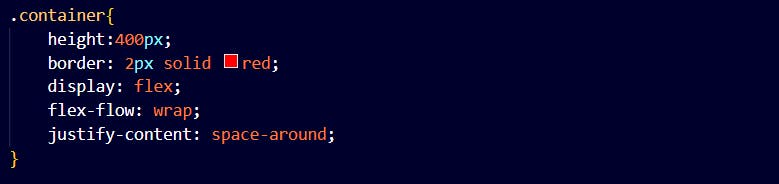
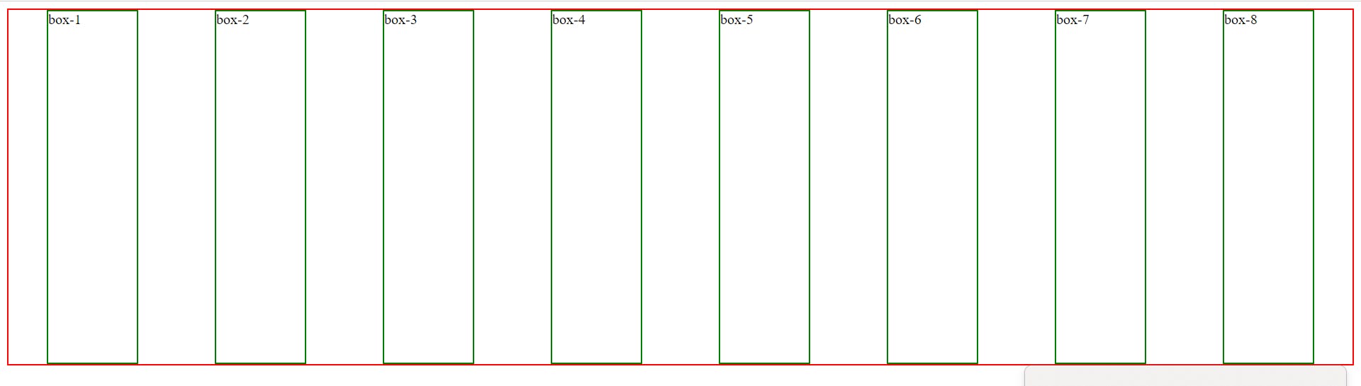
All the left-out spaces are also occupied now.
center
flex-end
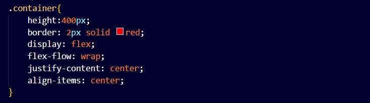
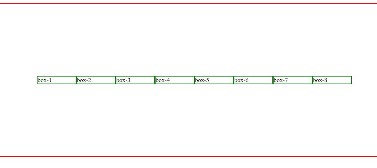
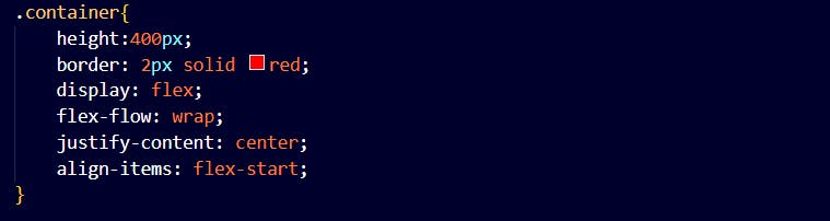
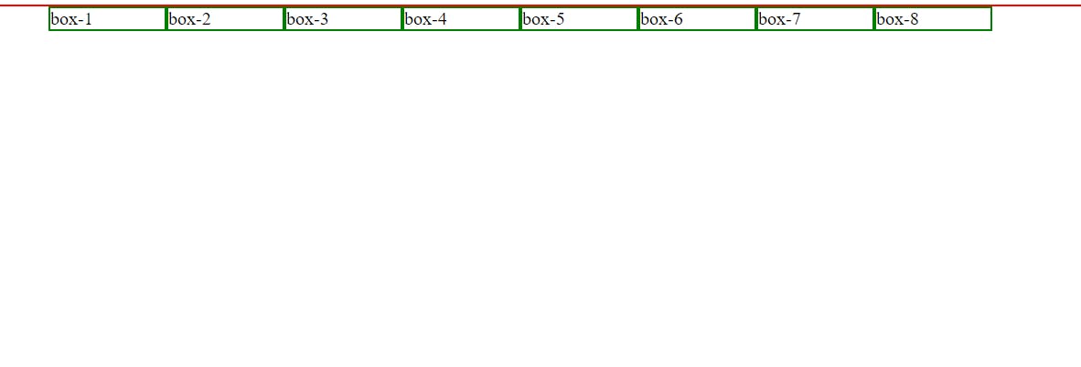
align-items
This property is used to align the flex items.
center
flex-start
flex-end
stretch
FLEX CHILD ITEMS
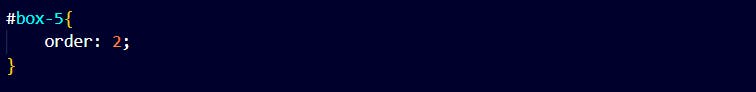
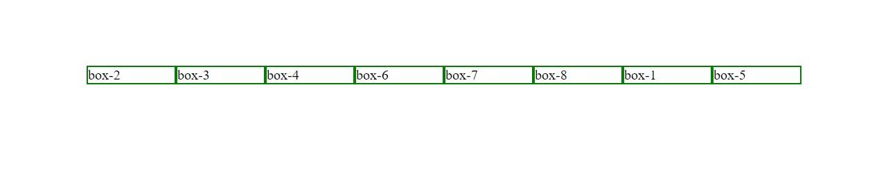
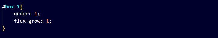
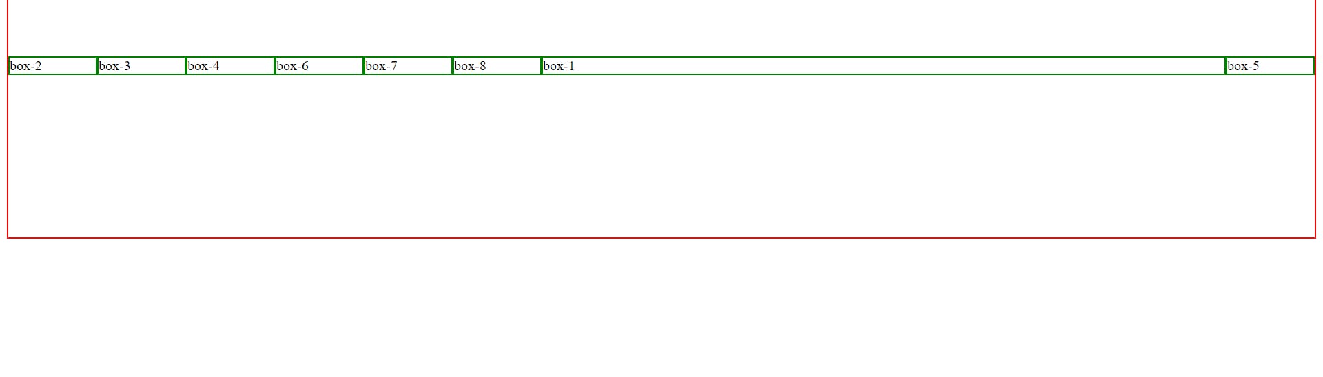
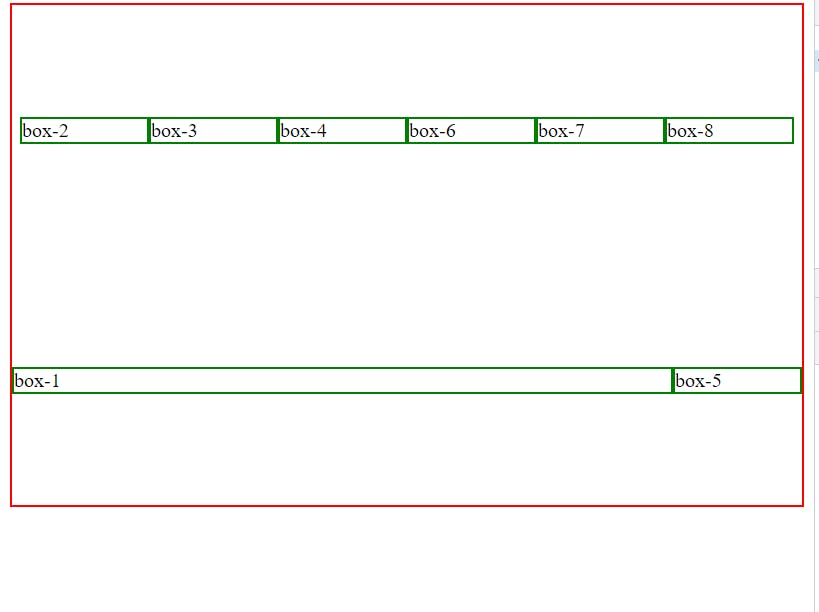
order
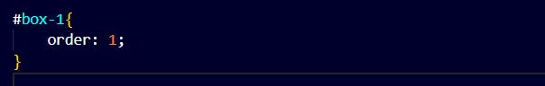
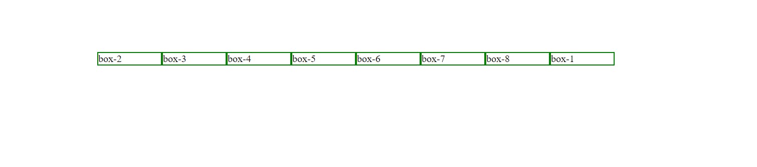
By default, every box has order 0. As we change the order of box-1 its position changes.
Flex-grow
This property specifies how much a flex item will grow relative to the rest of the flex items.
so when the screen is minimized
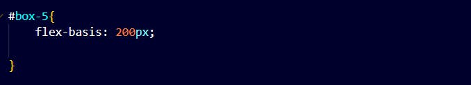
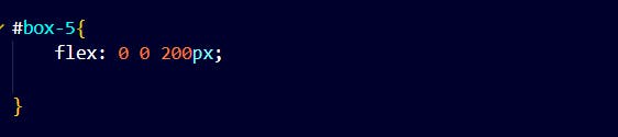
Flex-basis
This property defines the initial length of a flex item.
flex
It is a shorthand property for flex-grow, flex-shrink and flex-basis property.
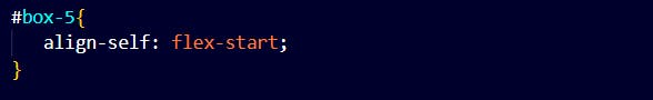
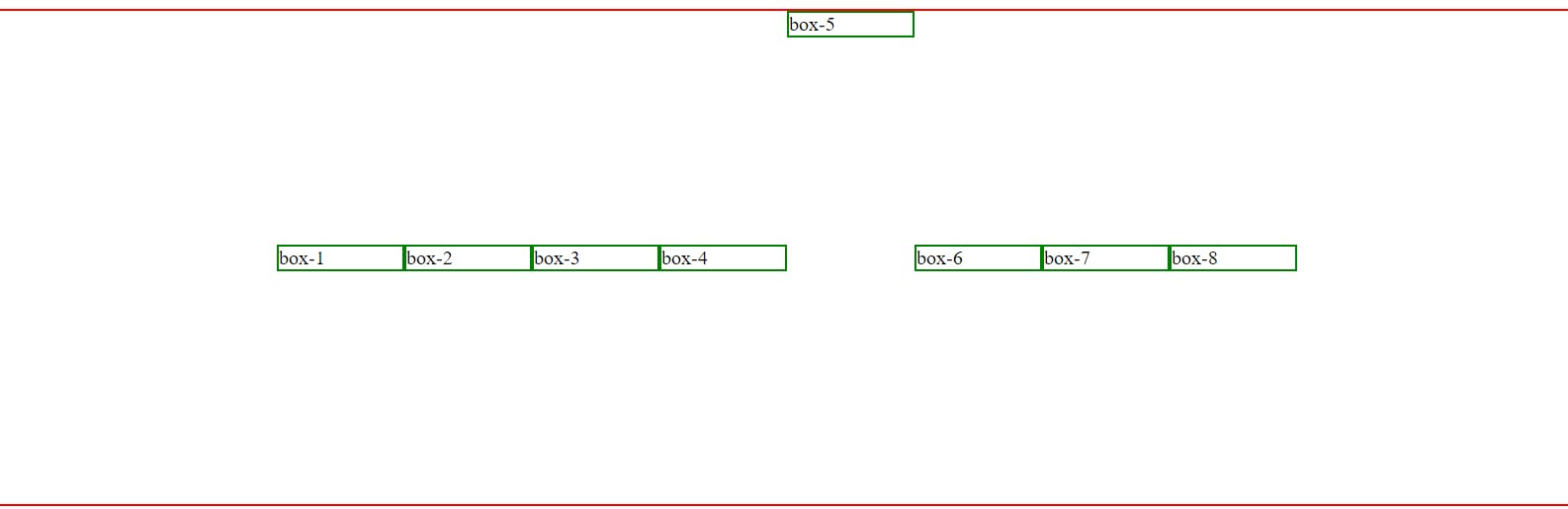
align-self
This property specifies the alignment for the selected item inside the flexible container.