


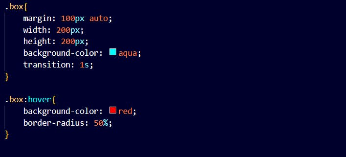
CSS transitions allow you to change property values smoothly over a given duration of time.

After hovering

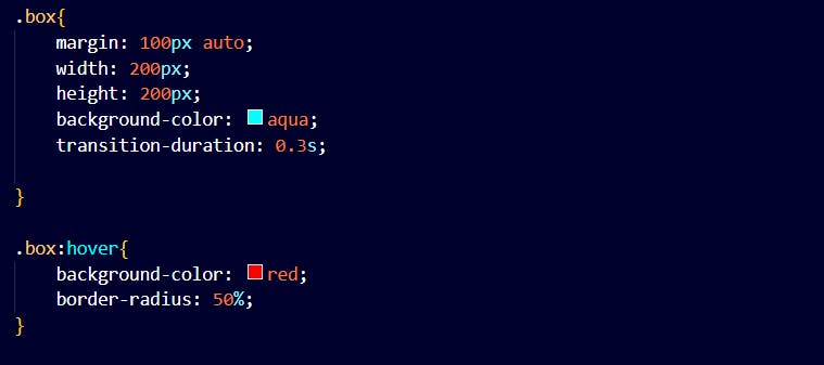
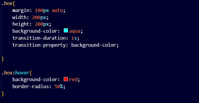
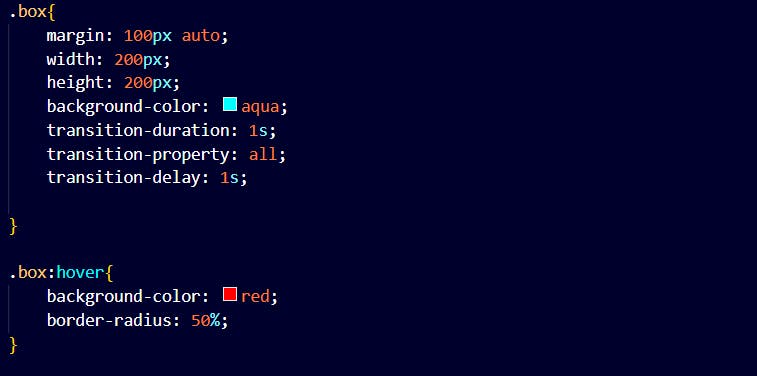
Properties of transition:
transition-duration
This specifies how many seconds or milliseconds a transition effect takes to complete.
Transition Property
This specifies the name of the CSS property the transition effect is for.
Transition-delay
This specifies a delay for the transition effect.
Transition-timing function
Specifies the speed curve of the transition effect.
It has the following values:
ease
specifies a transition effect with a slow start, then fast and then slow again. This is set by default.
linear
Specifies a transition effect with the same speed from start to end.
ease-in
specifies a transition effect with a slow start.
ease-out
Specifies a transition effect with the slow end.
ease-in-out
Specifies a transition effect with a slow start and end.
cubic-bezier(n, n, n, n)
Let's define values in the cubic-bezier function.
<!DOCTYPE html>
<html lang="en">
<head>
    <meta charset="UTF-8">
    <meta http-equiv="X-UA-Compatible" content="IE=edge">
    <meta name="viewport" content="width=device-width, initial-scale=1.0">
    <title>Document</title>
    <link rel="stylesheet" href="style.css">
</head>
<body>
    <div class="box"></div>
</body>
</html>
.box{
    margin: 100px auto;
    width: 200px;
    height: 200px;
    background-color: aqua;
    transition-duration: 1s;
    transition-property: all;
    transition-delay: 1s;
    transition-timing-function: ease-out;

}

.box:hover{
    background-color: red;
    border-radius: 50%;
}