


Table of contents
Data visualization is the representation of data or information in a visual format, such as charts, graphs, maps, or interactive visualizations.
Data visualization steps:
Obtaining and understanding data.
Prepare data
Identify your audience
Create the right kind of visualization.
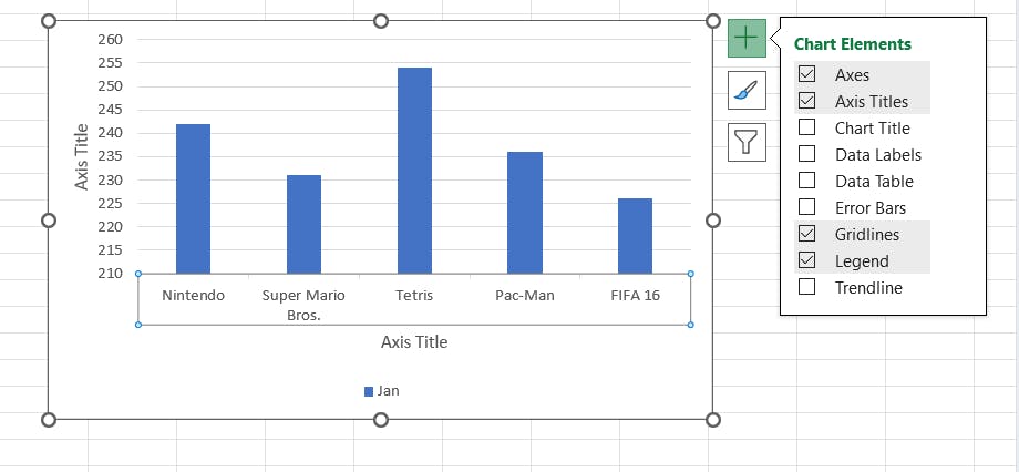
Axis Titles
Axis titles are labels that explain what that axis is all about.
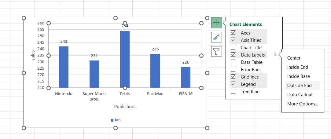
Data Labels
It helps the viewer to understand a particular data series or a data point by displaying the value next to it.
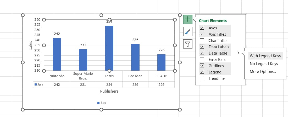
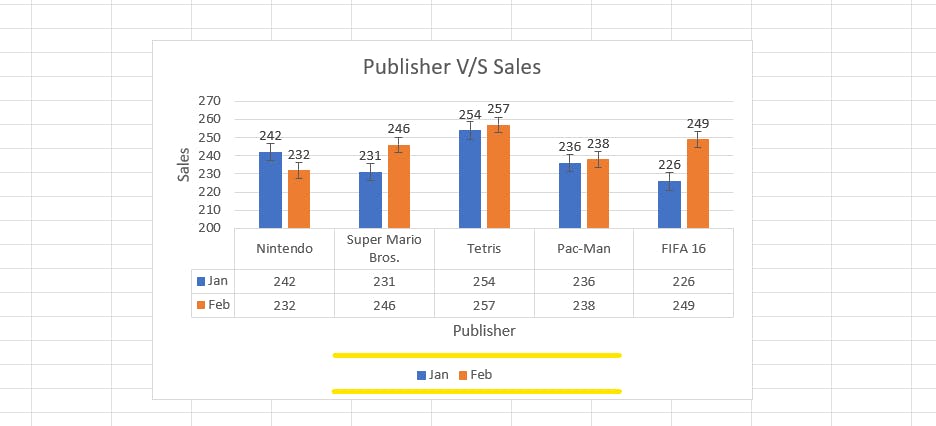
Data Table
It is useful when the user wants to see source data while looking at the chart.
It is available for Bar charts, Column charts, Area charts, and Line charts.
Error Bars
It is used to graphically show the potential error amounts with respect to each data marker in the data series.
It can only be applied to Bar charts, Column charts, Line charts, 2D Areas, X-Y Scatter charts, and Bubble charts.
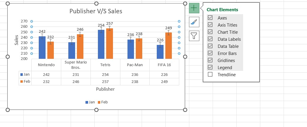
Legend
In Microsoft Excel, a legend refers to a key that provides information about the data series or categories represented in a chart or graph.
The legend helps users understand the meaning of various colors, patterns, or symbols used in the chart.
TrendLine
In Microsoft Excel, a trendline is a line or curve that is added to a chart to help analyze and visualize the trend or pattern in the data.
Trendlines are often used to identify and predict relationships between variables in a chart, such as linear, exponential, logarithmic, polynomial, or moving average trends.
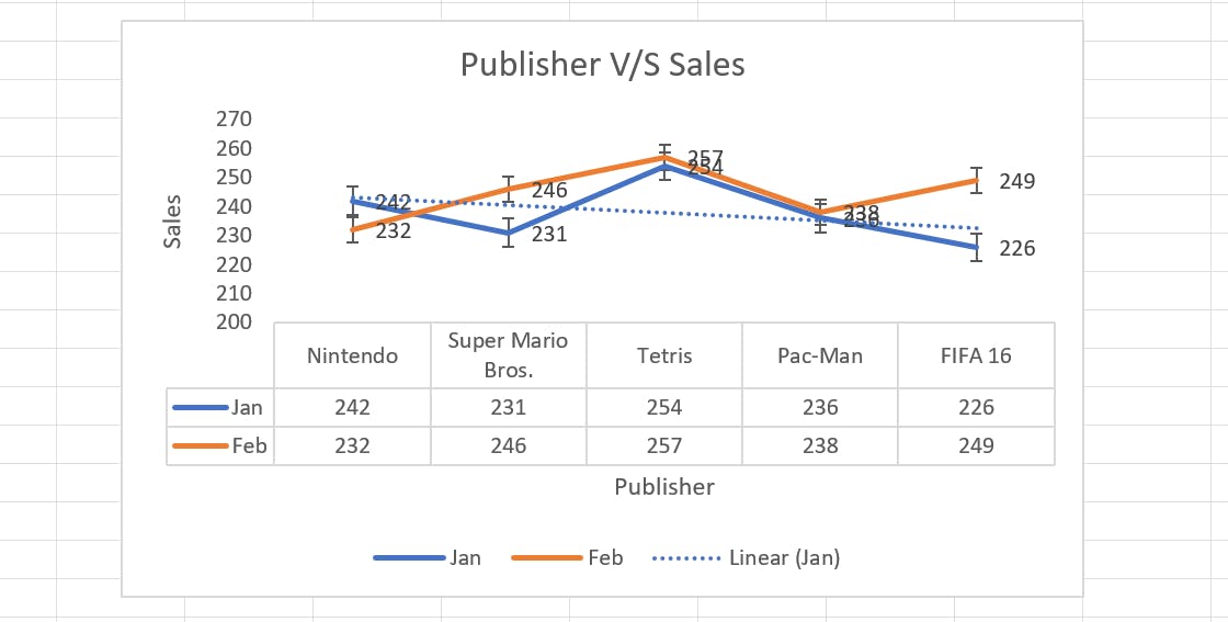
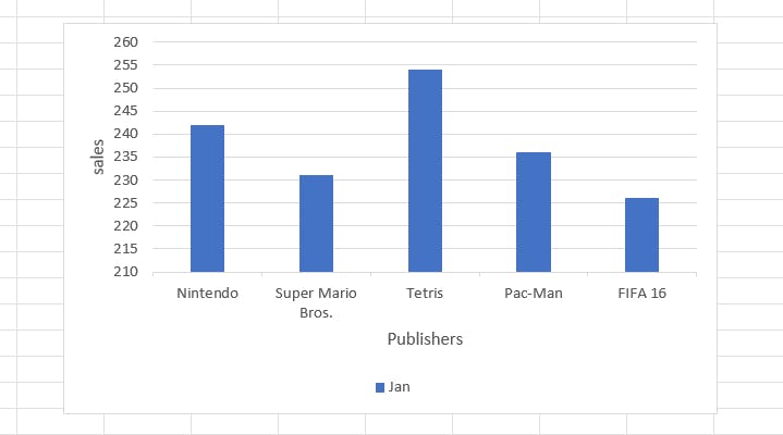
This shows the sales in January are dipping.